

Our objective was to design and prototype a unique end-to-end digital interactive product that solves a current core government problem in food security. We worked in a team of four people to create mobile, tablet, and desktop interfaces for our chosen service. In the end, we used adaptive design to ensure each device's interface enhanced the overall user experience through adjustments of screen sizes and cohesiveness.
Design Objective
Colorado PEAK is releasing the PEAK Pack, the easiest way to make use of your food benefits. The PEAK Pack is a subscription service that allows families to have meal kits sent directly to their house. The meal kits include a wide variety of fresh, pre-proportioned ingredients that are sourced from local farms, limiting food waste and streamlining the cooking process. PEAK Pack also eliminates grocery shopping, allowing busy families to indulge in more quality time together. PEAK Pack has hundreds of recipes to serve all palettes and accommodate various lifestyles. People who qualify for food stamps will be able to utilize our app/website to order and make healthy wholesome foods in a pinch.
-
Press Release: Download Here
Project Concept
My team consisted of four members. Each member provided insightful and useful feedback and participation throughout the whole process of the project. I was specifically responsible for sketching low-fidelity sketches for tablet and desktop, designing the high-fidelity of the desktop version, and managing/participating in the usability research for the desktop.
Responsibilities
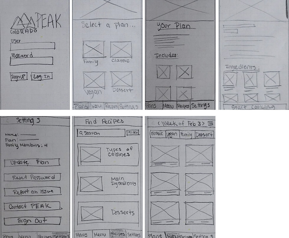
Low-Fidelity Design (Mobile, Tablet, Desktop)


High-Fidelity Designs


The purpose of our research is to discover whether users are able to successfully find and use important features within the app and website, such as checking out for the first time, setting up and editing their profile, and selecting their meals for the week. We would also like to find out whether potential users think this service would be useful for them.
The desired demographic of our research participants include people who have been/are currently qualified for food stamps. Some experiences included in our desired demographics are participants who are familiar with food subscription services or have an interest in them. We conducted our research on people who have been exposed to meal kit delivery subscription services before and/or have previously been qualified or currently have food stamps. Our testers ranged from the ages of 18 – 60.
Across all three devices, users had the easiest time navigating tablet and desktop. There were issues when TryMyUI displayed the mobile prototype and cut off the navigation and made it so users couldn’t complete the last three tasks, which skewed our results. From the data we collected, users were generally able to easily complete the tasks and did not have many usability issues, they felt that the service should provide more features, like variety in recipes and different meal categories.
The tasks for the desktop version were a little difficult and there was some confusion at first but eventually, users were able to easily navigate through the website. This was due to how vague the tasks were written. The tasks could definitely be written better in order to avoid any confusion for the user in the future. For example, some users were confused with the first task, which asked them to get started and log in. There was some confusion because the users didn’t know where to go after landing on the website. The user assumed they would click “log in” instead of “get started” on the home page. However, the users were able to click on “log in” but the function wasn’t working. Overall, users thought all of the functions and tasks were clear and user-friendly.
User Research Synthesis
Challenges
One of the challenges we faced during this project is translating our designs into each device. Through trial and error, we were able to create a design that was cohesive enough for easy user experience. We also came into the difficulty of finding inspirations for our app because we had to have subscriptions for sites such as HelloFresh and Blue Apron. But in the end, our group came together and carefully discussed and planned our high fidelity prototypes that translated well across all three devices.
Lessons Learned
During this group project, I learned about adaptive design and responsive design. For our group, we really focused on utilizing adaptive design in all of the different types of devices interfaces we had to design for. I learned it’s important to adjust all of the sizes and layout for each of the different devices since they have different potentials. For the tablet and desktop, it’s very critical in using all of the real estate space of the screen because they utilize bigger screen sizes. Each different devices have different user goals. For example for the mobile, users are always are on the go and prefer to use a mobile device for quick updates.